Summary: To create your Excel dashboard, you need to add relevant data into Excel and create your Workbook with datapoints. Let’s discover the steps to create a dashboard in Excel accurately.
An Excel dashboard is a great tool if you want to compare different data points, analyze various datasets, and represent it in a visually appealing format. These dashboards offer various colors, fonts, and formatting options to present info in a convenient manner.
In this article, you will learn about the steps to create a dashboard using Excel and also the best practices to design an interactive dashboard for yourself.
What is an Excel Dashboard?
An Excel Dashboard is a type of dashboard used to represent big datasets. These dashboards use elements such as tables, charts, gauges, waterfall charts, etc., to visually represent data. When data is represented in these dashboards, the data can be comprehended for an improved decision making.
Why Use Excel Dashboards?
Microsoft Excel dashboards make it easier to visualize complex data for improved decision making. In addition to that, they can help you with the following:
- Tracking Key Performance Indicators (KPIs)
- Performing complicated data calculations and analysis
- Improving data driven decision making
- Diagnosing and solving business problems
- Exploring scenarios for business forecasting and planning
7 Steps to Create an Excel Dashboard to Increase Work Efficiency
To create an Excel dashboard, you need to import the raw data and set up your workbook. After that, you need to select the right visuals to represent your data. Here is a step-by-step breakdown of steps you need to follow to build Excel dashboards.
Step 1: Import the Relevant Data into Excel
First, you need to add the relevant data to your Excel sheets. In case you already have data, then you can skip this step. However, if you are adding data, you can do it by pasting it, using an API to transfer data, or using Microsoft Power Query for the same.
However, you can also explore other options like Open Database Connectivity tools to import data before you create dashboard using Excel.
Step 2: Set Up the Workbook
After importing the data, you need to set the tabs to set up your workbook. For example, create three tabs or worksheets. One for Raw Data, second for Chart Data, and third for a Dashboard. This will make it easier to compare data in your Excel file.
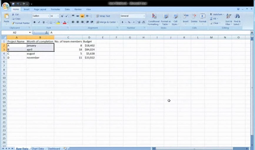
Here, we collected the raw data for A, B, C, and D projects. The details comprise project budget, completion month, and the number of team members working on each project.
Step 3: Insert Raw Data into the Table
The taw data worksheet created by you should be in Excel table format with all data points in available cells. This step is also called data cleaning step because in it, you can also spot any type of data errors.
Step 4: Perform Data Analysis
In this step, you need to look at the Raw Data that you have gathered and analyze it to decide whether you will be using it in the dashboard sheet. Once decided, add the selected data points in the ‘Chart Data’ worksheet.
For instance, if you want to highlight only project budget and completion month, then add only those datapoints in the Chart Data tab.
Step 5: Select the Right Visuals for Data
To represent data properly in the Excel dashboard, you need to choose the right visual format offered by Excel. Some of the most popular options include:
- Bar Chart: It compares graph values via bars
- Gauge Chart: Gauge chart in Excel lets you represent data in dial layout
- Waterfall Chart: This shows how an initial data point increases and decreases via several alternations to reach the end value
- Pie Chart: It shows the data in the pictorial form and divided into multiple slices.
- Pivot Table: This shows all the data in a tabular format
Step 6: Create the Excel Dashboard
To create your Excel dashboard, go to the dashboard worksheet that you created initially. Next, go to the ‘Insert’ > ‘Column’ > ‘Clustered Column Chart’. Once you go there, you will see a blank sheet where you will be feeding your data.
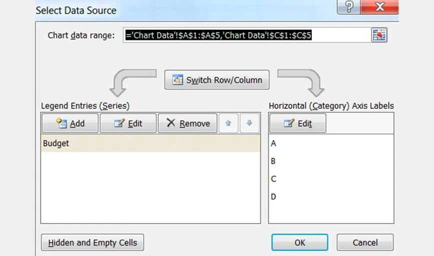
Click right on the blank box and choose ‘Select data’. Then go to ‘Chart Data’ workbook and choose the data you want to display in your Excel dashboard. After that, hit enter and your dashboard will be created.
In case the horizontal axis doesn’t show the data, then you can modify it. Go to select the chart again > right click > select data. After that, the Select Data Source box will pop up. Next, select ‘Edit’ under ‘Horizontal (Category) Axis Labels’ and select the data you want to display over the x-axis from the ‘Chart Data ‘workbook’.
Step 7: Customize the Created Dashboard
After you have created your dashboard, you can customize font, layout, and colors of your dashboard. Moreover, if you want to create an interactive dashboard, you can use a dynamic chart.
Under this, your data will be automatically updated when you change the data source. You can also use Macros, Drop-down lists, and Slicers to create interactive dashboards.
Excel Dashboard Design Best Practices
For an easily understandable dashboard, make sure you use colors, layout, and formatting consistently throughout the worksheet to avoid any confusion. Moreover, always visualize the information which is important for data analysis in the first place.
Here are some other practices that you can follow to create a dashboard in Excel.
- Keep the Design Simple: While building dashboards in Excel, make sure you use simple charts and design elements to easily comprehend the visualized data.
- Avoid Dashboard Overcrowding: Avoid using multiple colors, layouts, and elements that make the dashboard overcrowded. The crowded dashboard would become confusing and difficult to understand.
- Choose Colors Wisely: To present information in the dashboard, make sure you choose the color palette wisely. Red and green are the two most common colors that you can use in your dashboard for data visualization.
- Utilize Freeze Panes: When you are creating and working on large tables, you can use freeze panes to enhance readability. This will help keep a particular area of your worksheet visible when you are scrolling through different sections of the worksheet.
Popular Excel Dashboard Templates
Excel dashboards are a great way to visualize important datasets for better decision making. Instead of creating a dashboard from scratch, you can use an interactive dashboard Excel template for different use cases. Here are Excel dashboard examples for different use cases that you can consider:
KPI Excel Template
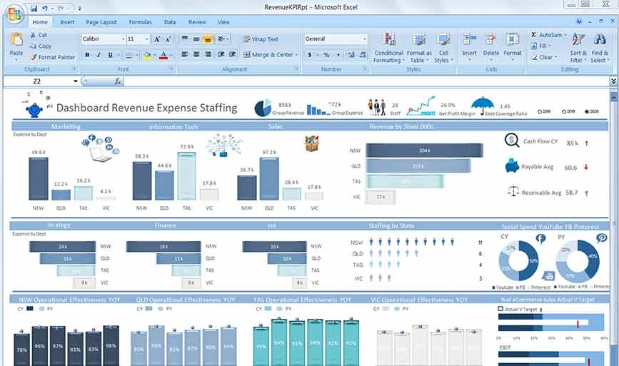
The KPI Excel Template will have a visual representation of all the Key Performance Indicators of your organization via graphs and charts. It will also highlight revenue and expenses of the organization for a specific year.
Project Management Dashboard Template
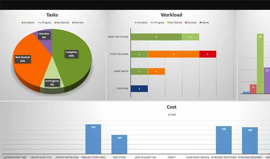
If you want to create a project management dashboard in Excel, then you can consider this template. It will visualize metrics like project name, employees involved, deadlines, sub-tasks, costs associated, etc.
Sales Dashboard Template
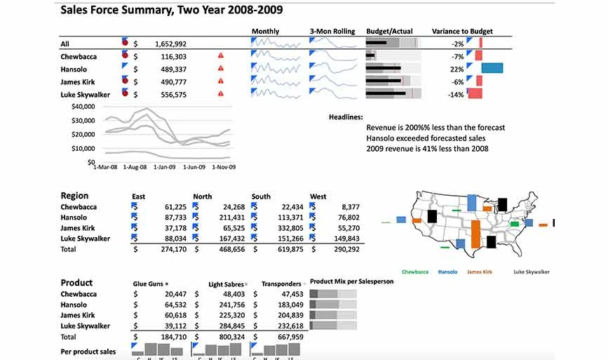
For designing a sales dashboard in Excel, you can use a Sales dashboard template. In this dashboard, you can visualize deals in the pipeline, deals closed, targets completed by employees, and so on.
Product Metrics Dashboard Template
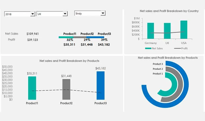
This template shows all the metrics related to the products you are selling like product sales, profit breakdown by product, product loss, etc.
Social Media Excel Dashboard Template
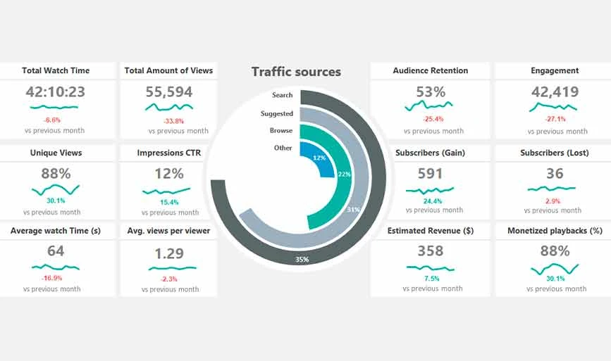
With this template, you can easily get a performance overview of your social media channel. This template will include metrics like engagement watch time, numbers of views, highest performing posts, etc.
Demerits of Using Excel Dashboards
Despite offering multiple benefits, Excel Dashboards also come with their own set of demerits. For example, these dashboards are complicated to use, require a lot of resources to set, and also pose data errors risks. Additionally, here are some demerits of using Excel dashboards:
- It takes a lot of time to set up complicated dashboards.
- Data manipulation may slow down the software and makes it difficult to update dashboards.
- Updating and viewing dashboard in smartphone is difficult
- One requires expertise to set up and create Excel dashboards
Conclusion: This guide on making a dashboard in Excel might have helped you a lot in understanding the Excel dashboards. By following each step of the procedure, you can easily create a dashboard based on your use case requirements. To simply your procedure, you can use multiple free Excel templates offered by Microsoft.
FAQs on How to Create a Dashboard inn Excel
How do I create a productivity dashboard in Excel?
To create a productivity dashboard in Excel, you need to import the data and cleanse it. Next, you should add data into the workbook and visualize it with charts for analysis. However, you can also use a productivity dashboard Excel template to quicky create one.
Is Excel dashboard free?
Yes, Excel offers multiple free dashboard templates for different use cases.
What is KPI dashboard?
A key performance indicator in dashboard is a type of measurable value that highlights how effectively the goals have been achieved or they have not been achieved.
Does Excel have dashboard templates?
Yes, Excel offers multiple free dashboard templates to create interactive dashboards for different use cases. For example, it offers templates for sales, social media, KPI performance, product metrics, etc.
How to create a sales dashboard in Excel?
To create a sales dashboard in Excel, you can use a template. With it, you can easily create a dashboard with info like the number of sales, sales closed, estimated sales budget, and so on.

Written by
Varsha ![]()
Varsha is an experienced content writer at Techjockey. She has been writing since 2021 and has covered several industries in her writing like fashion, technology, automobile, interior design, etc. Over the span of 1 year, she has written 100+ blogs focusing on security, finance, accounts, inventory, human resources,... Read more